Visualizing Uncertainties#
For any scientific measurement, accurate accounting of uncertainties is nearly as important, if not more so, as accurate reporting of the number itself. For example, imagine that I am using some astrophysical observations to estimate the Hubble Constant, the local measurement of the expansion rate of the Universe. I know that the current literature suggests a value of around 70 (km/s)/Mpc, and I measure a value of 74 (km/s)/Mpc with my method. Are the values consistent? The only correct answer, given this information, is this: there is no way to know.
Suppose I augment this information with reported uncertainties: the current literature suggests a value of 70 ± 2.5 (km/s)/Mpc, and my method has measured a value of 74 ± 5 (km/s)/Mpc. Now are the values consistent? That is a question that can be quantitatively answered.
In visualization of data and results, showing these errors effectively can make a plot convey much more complete information.
Basic Errorbars#
One standard way to visualize uncertainties is using an errorbar. A basic errorbar can be created with a single Matplotlib function call, as shown in the following figure:
%matplotlib inline
import matplotlib.pyplot as plt
plt.style.use('seaborn-whitegrid')
import numpy as np
x = np.linspace(0, 10, 50)
dy = 0.8
y = np.sin(x) + dy * np.random.randn(50)

plt.errorbar(x, y, yerr=dy, fmt='.k');
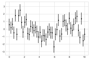
Here the fmt is a format code controlling the appearance of lines and points, and it has the same syntax as the shorthand used in plt.plot, outlined in the previous chapter and earlier in this chapter.
In addition to these basic options, the errorbar function has many options to fine-tune the outputs.
Using these additional options you can easily customize the aesthetics of your errorbar plot.
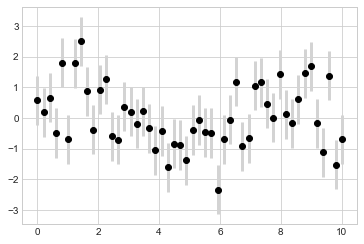
I often find it helpful, especially in crowded plots, to make the errorbars lighter than the points themselves (see the following figure):
plt.errorbar(x, y, yerr=dy, fmt='o', color='black',
             ecolor='lightgray', elinewidth=3, capsize=0);
In addition to these options, you can also specify horizontal errorbars, one-sided errorbars, and many other variants.
For more information on the options available, refer to the docstring of plt.errorbar.
Continuous Errors#
In some situations it is desirable to show errorbars on continuous quantities.
Though Matplotlib does not have a built-in convenience routine for this type of application, it’s relatively easy to combine primitives like plt.plot and plt.fill_between for a useful result.
Here we’ll perform a simple Gaussian process regression, using the Scikit-Learn API (see Introducing Scikit-Learn for details). This is a method of fitting a very flexible nonparametric function to data with a continuous measure of the uncertainty. We won’t delve into the details of Gaussian process regression at this point, but will focus instead on how you might visualize such a continuous error measurement:
from sklearn.gaussian_process import GaussianProcessRegressor

# define the model and draw some data
model = lambda x: x * np.sin(x)
xdata = np.array([1, 3, 5, 6, 8])
ydata = model(xdata)

# Compute the Gaussian process fit
gp = GaussianProcessRegressor()
gp.fit(xdata[:, np.newaxis], ydata)

xfit = np.linspace(0, 10, 1000)
yfit, dyfit = gp.predict(xfit[:, np.newaxis], return_std=True)
We now have xfit, yfit, and dyfit, which sample the continuous fit to our data.
We could pass these to the plt.errorbar function as in the previous section, but we don’t really want to plot 1,000 points with 1,000 errorbars.
Instead, we can use the plt.fill_between function with a light color to visualize this continuous error (see the following figure):
# Visualize the result
plt.plot(xdata, ydata, 'or')
plt.plot(xfit, yfit, '-', color='gray')
plt.fill_between(xfit, yfit - dyfit, yfit + dyfit,
                 color='gray', alpha=0.2)
plt.xlim(0, 10);
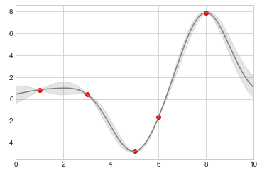
Take a look at the fill_between call signature: we pass an x value, then the lower y-bound, then the upper y-bound, and the result is that the area between these regions is filled.
The resulting figure gives an intuitive view into what the Gaussian process regression algorithm is doing: in regions near a measured data point, the model is strongly constrained, and this is reflected in the small model uncertainties. In regions far from a measured data point, the model is not strongly constrained, and the model uncertainties increase.
For more information on the options available in plt.fill_between (and the closely related plt.fill function), see the function docstring or the Matplotlib documentation.
Finally, if this seems a bit too low-level for your taste, refer to Visualization With Seaborn, where we discuss the Seaborn package, which has a more streamlined API for visualizing this type of continuous errorbar.