Simple Scatter Plots#
Another commonly used plot type is the simple scatter plot, a close cousin of the line plot. Instead of points being joined by line segments, here the points are represented individually with a dot, circle, or other shape. We’ll start by setting up the notebook for plotting and importing the packages we will use:
%matplotlib inline
import matplotlib.pyplot as plt
plt.style.use('seaborn-whitegrid')
import numpy as np
Scatter Plots with plt.plot#
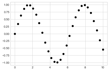
In the previous chapter we looked at using plt.plot/ax.plot to produce line plots.
It turns out that this same function can produce scatter plots as well (see the following figure):
x = np.linspace(0, 10, 30)
y = np.sin(x)

plt.plot(x, y, 'o', color='black');
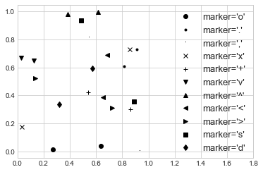
The third argument in the function call is a character that represents the type of symbol used for the plotting. Just as you can specify options such as '-' or '--' to control the line style, the marker style has its own set of short string codes. The full list of available symbols can be seen in the documentation of plt.plot, or in Matplotlib’s online documentation. Most of the possibilities are fairly intuitive, and a number of the more common ones are demonstrated here (see the following figure):
rng = np.random.default_rng(0)
for marker in ['o', '.', ',', 'x', '+', 'v', '^', '<', '>', 's', 'd']:
    plt.plot(rng.random(2), rng.random(2), marker, color='black',
             label="marker='{0}'".format(marker))
plt.legend(numpoints=1, fontsize=13)
plt.xlim(0, 1.8);
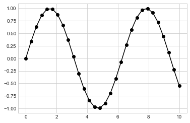
For even more possibilities, these character codes can be used together with line and color codes to plot points along with a line connecting them (see the following figure):
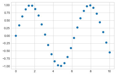
plt.plot(x, y, '-ok');
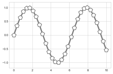
Additional keyword arguments to plt.plot specify a wide range of properties of the lines and markers, as you can see in the following figure:
plt.plot(x, y, '-p', color='gray',
         markersize=15, linewidth=4,
         markerfacecolor='white',
         markeredgecolor='gray',
         markeredgewidth=2)
plt.ylim(-1.2, 1.2);
These kinds of options make plt.plot the primary workhorse for two-dimensional plots in Matplotlib.
For a full description of the options available, refer to the plt.plot documentation.
Scatter Plots with plt.scatter#
A second, more powerful method of creating scatter plots is the plt.scatter function, which can be used very similarly to the plt.plot function (see the following figure):
plt.scatter(x, y, marker='o');
The primary difference of plt.scatter from plt.plot is that it can be used to create scatter plots where the properties of each individual point (size, face color, edge color, etc.) can be individually controlled or mapped to data.
Let’s show this by creating a random scatter plot with points of many colors and sizes.
In order to better see the overlapping results, we’ll also use the alpha keyword to adjust the transparency level (see the following figure):
rng = np.random.default_rng(0)
x = rng.normal(size=100)
y = rng.normal(size=100)
colors = rng.random(100)
sizes = 1000 * rng.random(100)

plt.scatter(x, y, c=colors, s=sizes, alpha=0.3)
plt.colorbar();  # show color scale
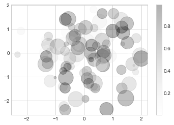
Notice that the color argument is automatically mapped to a color scale (shown here by the colorbar command), and that the size argument is given in pixels.
In this way, the color and size of points can be used to convey information in the visualization, in order to visualize multidimensional data.
For example, we might use the Iris dataset from Scikit-Learn, where each sample is one of three types of flowers that has had the size of its petals and sepals carefully measured (see the following figure):
from sklearn.datasets import load_iris
iris = load_iris()
features = iris.data.T

plt.scatter(features[0], features[1], alpha=0.4,
            s=100*features[3], c=iris.target, cmap='viridis')
plt.xlabel(iris.feature_names[0])
plt.ylabel(iris.feature_names[1]);
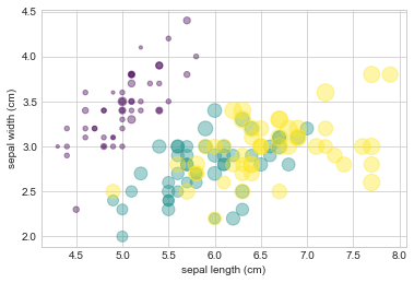
A full-color version of this plot is available in the online version of the book.
We can see that this scatter plot has given us the ability to simultaneously explore four different dimensions of the data: the (x, y) location of each point corresponds to the sepal length and width, the size of the point is related to the petal width, and the color is related to the particular species of flower. Multicolor and multifeature scatter plots like this can be useful for both exploration and presentation of data.
plot Versus scatter: A Note on Efficiency#
Aside from the different features available in plt.plot and plt.scatter, why might you choose to use one over the other? While it doesn’t matter as much for small amounts of data, as datasets get larger than a few thousand points, plt.plot can be noticeably more efficient than plt.scatter.
The reason is that plt.scatter has the capability to render a different size and/or color for each point, so the renderer must do the extra work of constructing each point individually.
With plt.plot, on the other hand, the markers for each point are guaranteed to be identical, so the work of determining the appearance of the points is done only once for the entire set of data.
For large datasets, this difference can lead to vastly different performance, and for this reason, plt.plot should be preferred over plt.scatter for large datasets.