Simple Line Plots#
Perhaps the simplest of all plots is the visualization of a single function \(y = f(x)\). Here we will take a first look at creating a simple plot of this type. As in all the following chapters, we’ll start by setting up the notebook for plotting and importing the packages we will use:
%matplotlib inline
import matplotlib.pyplot as plt
plt.style.use('seaborn-whitegrid')
import numpy as np
For all Matplotlib plots, we start by creating a figure and axes. In their simplest form, this can be done as follows (see the following figure):
fig = plt.figure()
ax = plt.axes()
In Matplotlib, the figure (an instance of the class plt.Figure) can be thought of as a single container that contains all the objects representing axes, graphics, text, and labels.
The axes (an instance of the class plt.Axes) is what we see above: a bounding box with ticks, grids, and labels, which will eventually contain the plot elements that make up our visualization.
Throughout this part of the book, I’ll commonly use the variable name fig to refer to a figure instance and ax to refer to an axes instance or group of axes instances.
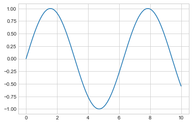
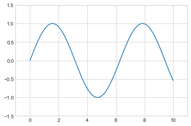
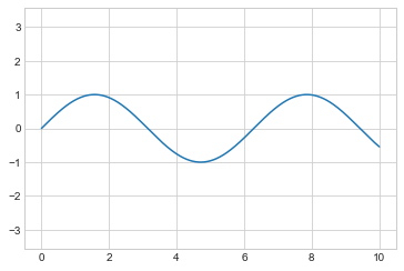
Once we have created an axes, we can use the ax.plot method to plot some data. Let’s start with a simple sinusoid, as shown in the following figure:
fig = plt.figure()
ax = plt.axes()

x = np.linspace(0, 10, 1000)
ax.plot(x, np.sin(x));
Note that the semicolon at the end of the last line is intentional: it suppresses the textual representation of the plot from the output.
Alternatively, we can use the PyLab interface and let the figure and axes be created for us in the background (see Two Interfaces for the Price of One for a discussion of these two interfaces); as the following figure shows, the result is the same:
plt.plot(x, np.sin(x));
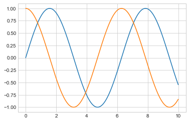
If we want to create a single figure with multiple lines (see the following figure), we can simply call the plot function multiple times:
plt.plot(x, np.sin(x))
plt.plot(x, np.cos(x));
That’s all there is to plotting simple functions in Matplotlib! We’ll now dive into some more details about how to control the appearance of the axes and lines.
Adjusting the Plot: Line Colors and Styles#
The first adjustment you might wish to make to a plot is to control the line colors and styles.
The plt.plot function takes additional arguments that can be used to specify these.
To adjust the color, you can use the color keyword, which accepts a string argument representing virtually any imaginable color.
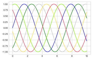
The color can be specified in a variety of ways; see the following figure for the output of the following examples:
plt.plot(x, np.sin(x - 0), color='blue')        # specify color by name
plt.plot(x, np.sin(x - 1), color='g')           # short color code (rgbcmyk)
plt.plot(x, np.sin(x - 2), color='0.75')        # grayscale between 0 and 1
plt.plot(x, np.sin(x - 3), color='#FFDD44')     # hex code (RRGGBB, 00 to FF)
plt.plot(x, np.sin(x - 4), color=(1.0,0.2,0.3)) # RGB tuple, values 0 to 1
plt.plot(x, np.sin(x - 5), color='chartreuse'); # HTML color names supported
If no color is specified, Matplotlib will automatically cycle through a set of default colors for multiple lines.
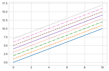
Similarly, the line style can be adjusted using the linestyle keyword (see the following figure):
plt.plot(x, x + 0, linestyle='solid')
plt.plot(x, x + 1, linestyle='dashed')
plt.plot(x, x + 2, linestyle='dashdot')
plt.plot(x, x + 3, linestyle='dotted');

# For short, you can use the following codes:
plt.plot(x, x + 4, linestyle='-')  # solid
plt.plot(x, x + 5, linestyle='--') # dashed
plt.plot(x, x + 6, linestyle='-.') # dashdot
plt.plot(x, x + 7, linestyle=':');  # dotted
Though it may be less clear to someone reading your code, you can save some keystrokes by combining these linestyle and color codes into a single non-keyword argument to the plt.plot function; the following figure shows the result:
plt.plot(x, x + 0, '-g')   # solid green
plt.plot(x, x + 1, '--c')  # dashed cyan
plt.plot(x, x + 2, '-.k')  # dashdot black
plt.plot(x, x + 3, ':r');  # dotted red
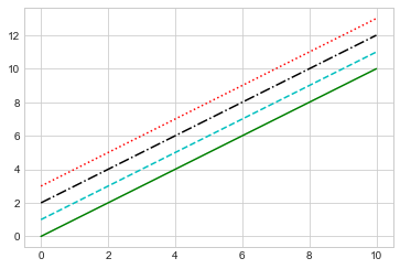
These single-character color codes reflect the standard abbreviations in the RGB (Red/Green/Blue) and CMYK (Cyan/Magenta/Yellow/blacK) color systems, commonly used for digital color graphics.
There are many other keyword arguments that can be used to fine-tune the appearance of the plot; for details, read through the docstring of the plt.plot function using IPython’s help tools (see Help and Documentation in IPython).
Adjusting the Plot: Axes Limits#
Matplotlib does a decent job of choosing default axes limits for your plot, but sometimes it’s nice to have finer control.
The most basic way to adjust the limits is to use the plt.xlim and plt.ylim functions (see the following figure):
plt.plot(x, np.sin(x))

plt.xlim(-1, 11)
plt.ylim(-1.5, 1.5);
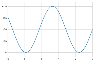
If for some reason you’d like either axis to be displayed in reverse, you can simply reverse the order of the arguments (see the following figure):
plt.plot(x, np.sin(x))

plt.xlim(10, 0)
plt.ylim(1.2, -1.2);
A useful related method is plt.axis (note here the potential confusion between axes with an e, and axis with an i), which allows more qualitative specifications of axis limits. For example, you can automatically tighten the bounds around the current content, as shown in the following figure:
plt.plot(x, np.sin(x))
plt.axis('tight');
Or you can specify that you want an equal axis ratio, such that one unit in x is visually equivalent to one unit in y, as seen in the following figure:
plt.plot(x, np.sin(x))
plt.axis('equal');
Other axis options include 'on', 'off', 'square', 'image', and more. For more information on these, refer to the plt.axis docstring.
Labeling Plots#
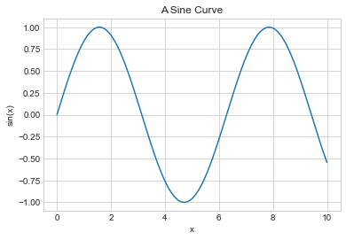
As the last piece of this chapter, we’ll briefly look at the labeling of plots: titles, axis labels, and simple legends. Titles and axis labels are the simplest such labels—there are methods that can be used to quickly set them (see the following figure):
plt.plot(x, np.sin(x))
plt.title("A Sine Curve")
plt.xlabel("x")
plt.ylabel("sin(x)");
The position, size, and style of these labels can be adjusted using optional arguments to the functions, described in the docstrings.
When multiple lines are being shown within a single axes, it can be useful to create a plot legend that labels each line type.
Again, Matplotlib has a built-in way of quickly creating such a legend; it is done via the (you guessed it) plt.legend method.
Though there are several valid ways of using this, I find it easiest to specify the label of each line using the label keyword of the plot function (see the following figure):
plt.plot(x, np.sin(x), '-g', label='sin(x)')
plt.plot(x, np.cos(x), ':b', label='cos(x)')
plt.axis('equal')

plt.legend();
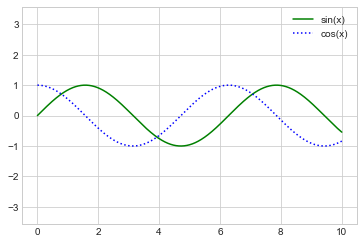
As you can see, the plt.legend function keeps track of the line style and color, and matches these with the correct label.
More information on specifying and formatting plot legends can be found in the plt.legend docstring; additionally, we will cover some more advanced legend options in Customizing Plot Legends.
Matplotlib Gotchas#
While most plt functions translate directly to ax methods (plt.plot → ax.plot, plt.legend → ax.legend, etc.), this is not the case for all commands.
In particular, functions to set limits, labels, and titles are slightly modified.
For transitioning between MATLAB-style functions and object-oriented methods, make the following changes:
plt.xlabel→ax.set_xlabelplt.ylabel→ax.set_ylabelplt.xlim→ax.set_xlimplt.ylim→ax.set_ylimplt.title→ax.set_title
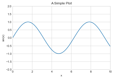
In the object-oriented interface to plotting, rather than calling these functions individually, it is often more convenient to use the ax.set method to set all these properties at once (see the following figure):
ax = plt.axes()
ax.plot(x, np.sin(x))
ax.set(xlim=(0, 10), ylim=(-2, 2),
       xlabel='x', ylabel='sin(x)',
       title='A Simple Plot');